Big Blue Button

Company
Blindside Networks
Year
2017
Type
Visual Design
Interaction Design
BigBlueButton is a video and presentation platform mainly used by schools and universities, and the US Department of Defense. It was originally built back in 2007 using Adobe Flash but once HTML5 became a more widely accepted platform, BigBlueButton began transferring over the newer technologies, and because of this, required a redesign of the platform.

This redesign deals with the interaction features between the presenter and the audience. My specific design space is targeted towards large user sessions such as university classes, which can vary anywhere between 50 students to 500+. For example, my primary user would be a professor who is presenting to an online class.

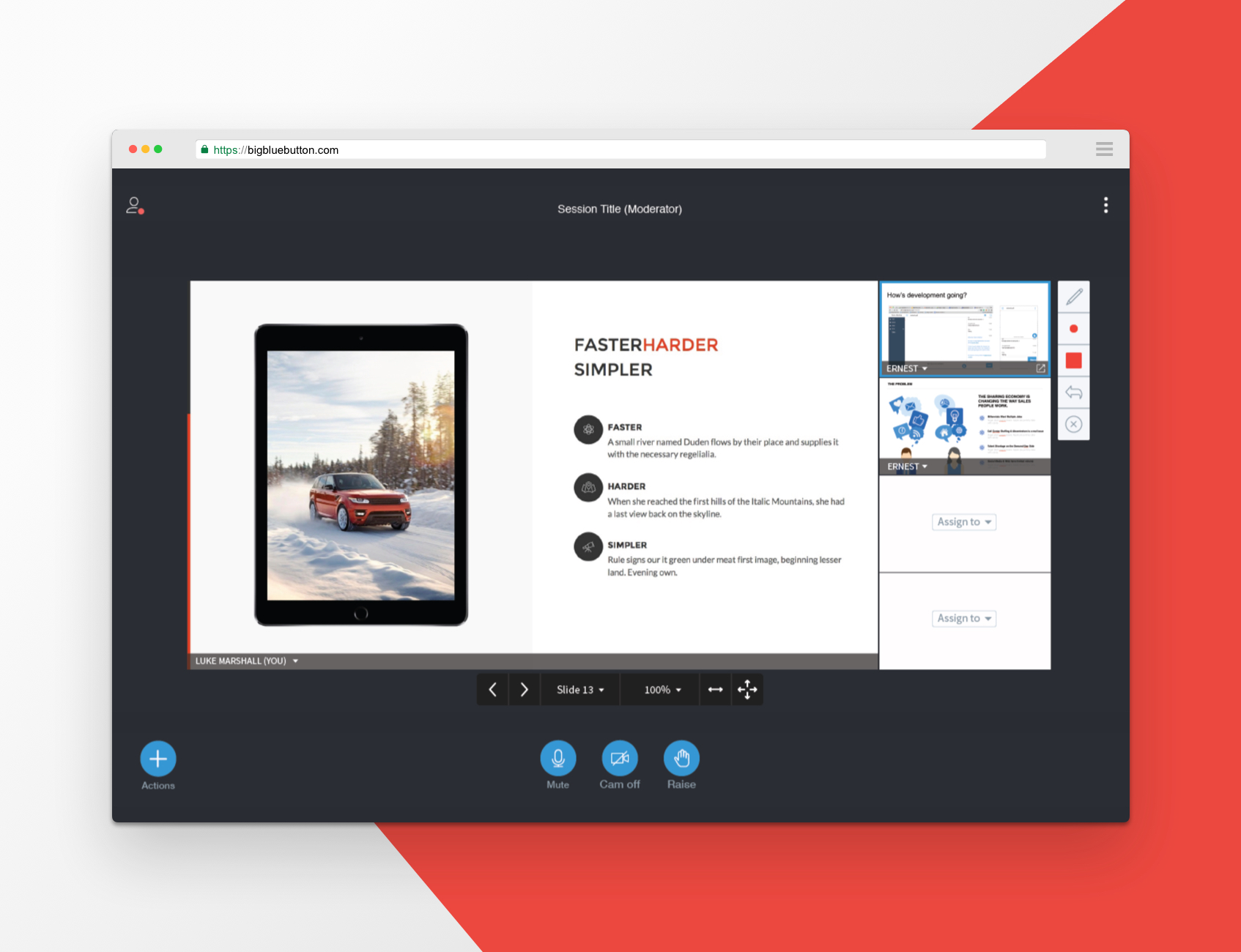
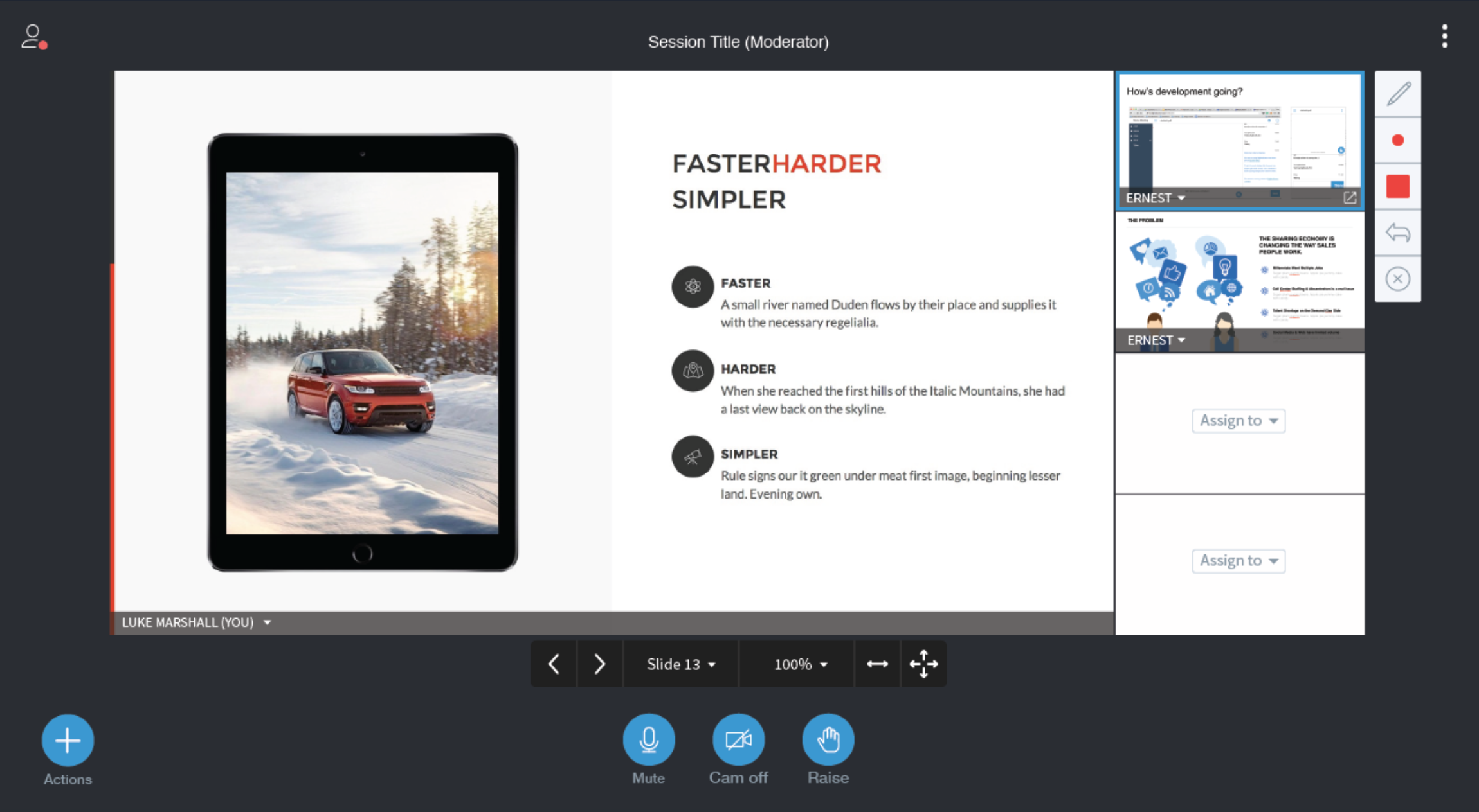
High fidelity design of the presenter screen.

Problem Definition

The original BigBlueButton platform was created in 2007. It was designed modularly with each feature constructed as its own modular component allowing flexibility for the user. They could drag and drop sections, increase the size of sections, remove and add their own sections during a video chat session.

As new features were added, users found the modular design to be difficult to use and handle. The customizability of the platform increased the cognitive load and decreased the usability. The platform did not prioritize the important sections for the user causing frustration.

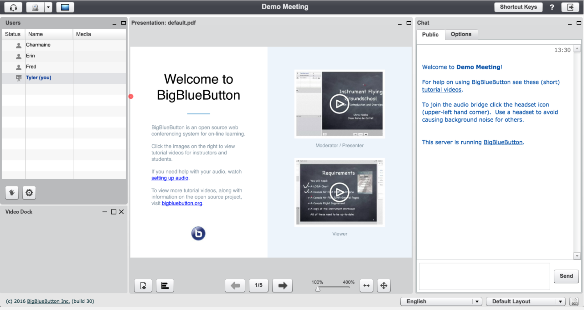
Original BigBlueButton design

Proposed Solution

Moving forward with the new HTML5 client, a redesign was needed to help prioritize the “must have” features. The modular customizability will restricted for IT administration only so the features of the platform can be defined on a project to project basis. This will increase the usability for the platform users so that they will not have to think about appending, resizing, and handling sections.

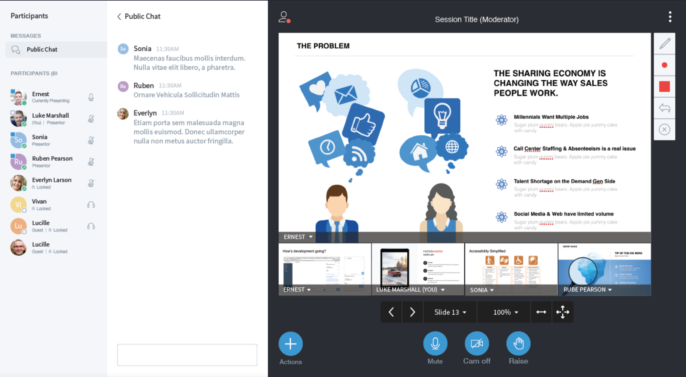
Standard presenter display (left), presenter window with chat open (right)

Target Audience

Viewer

People who participate in large video calling presentations find it difficult to interact with the presenter, and therefore resulted in low engagement during the session.

Presenter

A presenter who is presenting to a large group of users, find it difficult to juggle presenting, and staying aware of the audience and the level of engagement

UX Goals

My main goal for the redesign was to mimic and enhance the in class experience. The platform should encourage open discussion and questions during lectures for the students. For the presenter, the interface needed to support their teaching needs and ability to stay engaged with the students.

Approach

1. Customer Clinics

To gain deeper insights of this project, we talked with a variety of our target audience such as students and professors using our product. Here are a few key insights: Taking these the feedback, we were able to guide our redesign of the platform so that it aligned more closely with our customer’s needs.

2. Design Critiques

Throughout this process the design team at Blindside Networks held design critique sessions. There were two types of sessions held: closed design sessions held with designers only and open sessions with developers and project managers as well. This process helped me see new perspectives, edge cases, and ensured our product was moving forward in the right direction.

Collaboration design session to improve the product

3. Designing for the Office Ecosystem

A key factor when designing a feature for Office applications was to keep in mind of the Office ecosystem. The Office365 suite of applications thrive when the interactions between applications is a seamless and a consistent experience. Consistency is created with repetition of user workflows, UX patterns, and visual styles.

Smart Tagger created consistency by leveraging the existing tagging patterns in OneNote. The similar UX pattern is used across other external products with tagging and would feel natural for Microsoft customers. For visual consistency, Smart Tagger used FabricUI, Office365’s design system. This ensured that Smart Tagger will look the same as other features within Office applications. An additional benefit with the choice to use FabricUI, was that the development process will be simplified by leveraging the pre-built components.

The last key factor in designing for the Office ecosystem was to design with the full cycle in mind, in other words, designing to “close the loop”. Tag entry may be the action of focus for Smart Tagger, but it is equally important to understand the impact of tags during the search process. Although designing how tags are searched is out of scope, mockups and design explorations were created to help the team visualize how Smart Tagger fits into this problem space.

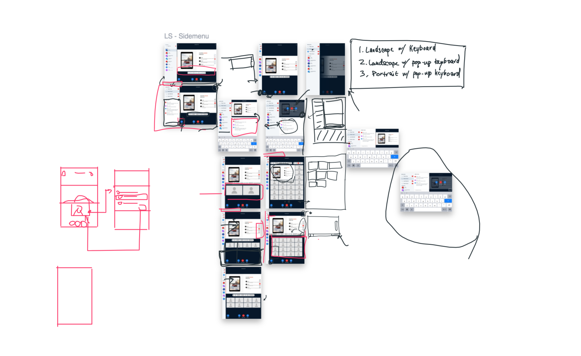
Designing for Multiple Devices

One main requirement our product had, was that it needed to function seamlessly on multiple devices (mobile, tablet, and computers). A key insight gained from our research as that online classes were meant to be flexible. Students wanted to be able to join anytime anywhere, included on the bus with their phones and tablets, or at home with their computers.


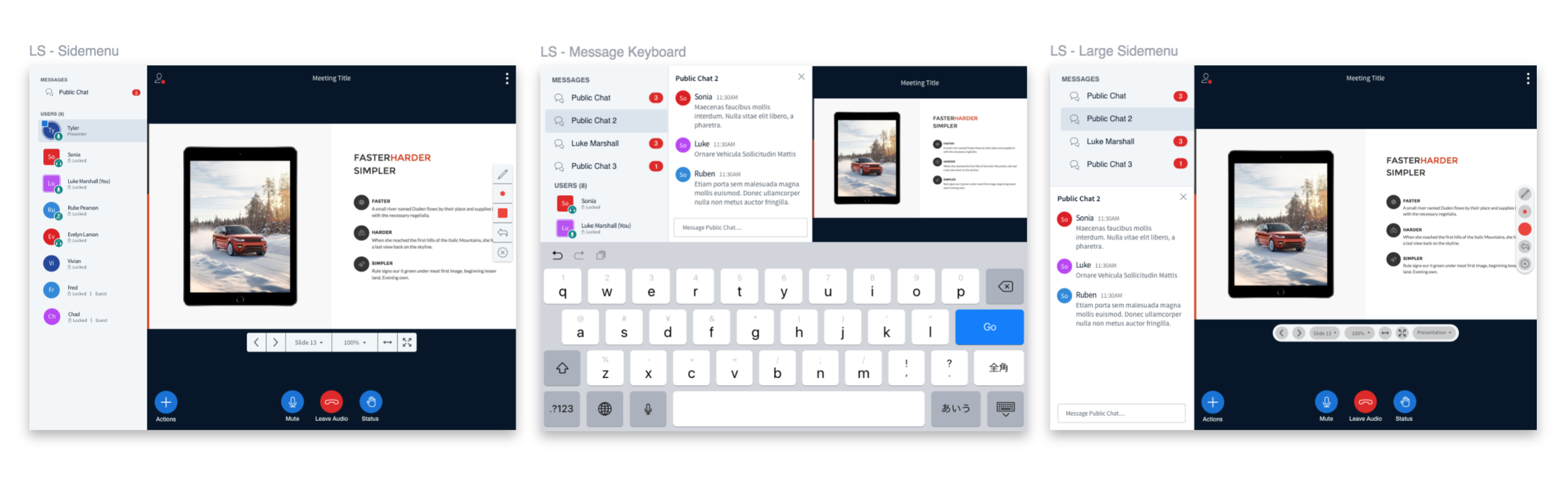
Landscape tablet designs

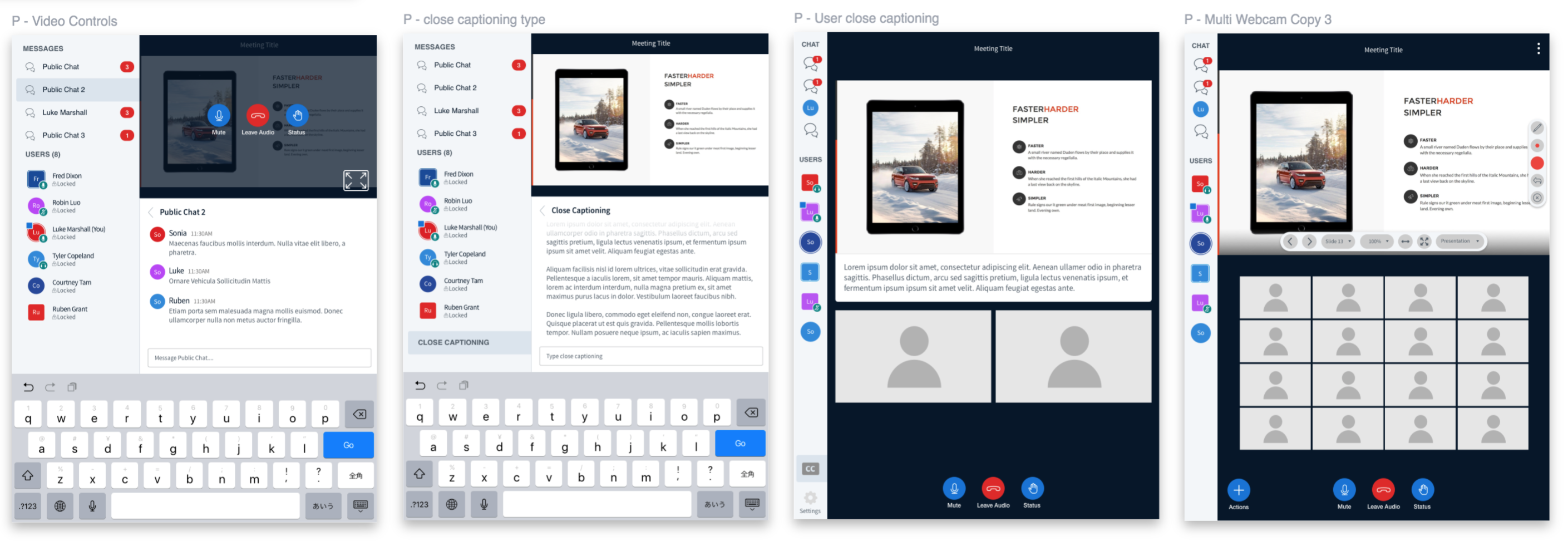
Portrait tablet designs
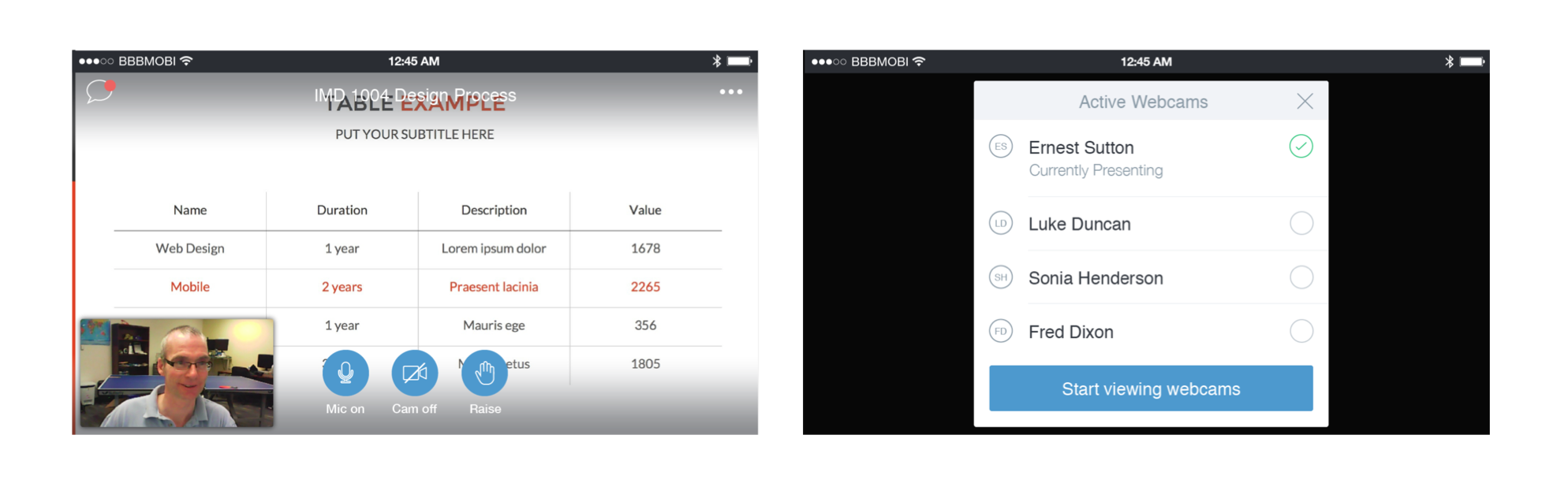
Mobile designs

Designing for Multiple Videos

A big challenge faced in the design process was designing the interactions of the application for multiple users. A typical lecture generally has 50+ students participating and there was no way in predicting how many students would have their webcam on. This could easily get out of hand and cause the design to feel cluttered. To solve this issue, we designed the platform to cycle through video webcams and to bring the user who was speaking to the front screen. We designed multiple layouts of how multiple video webcams can be displayed. These layouts were used in future user testing.


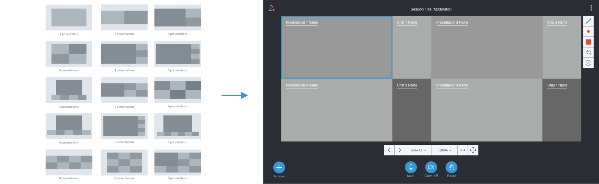
Multiple video layout design explorations

An additional function we added to the system was a “Raise hand” function. This was a notification feature that allowed students to notify the lecturer that a question needed to be asked; much like in an in-class lecture setting. By doing this, we can ensure questions were not lost in the chat window even with 50+ participants.

Looking Back

The BigBlueButton project brought many new design challenges. I had never worked on designing a video platform prior to this project so it was great learning opportunity. I particularly found it interested learning to design video layouts. Looking back, I should have took a deeper look into the technical constraints for the layout options within the HTML5 Client. Although, my co-op ended prior to the development process of the new redesign, I hypothesize that a few of the options I had designs will not be feasible due to the technical constraints. Therefore, my key takeaway from this project would be to work more closely with the developers earlier on in the project to understand the technical side of the project.
Next Project:
Hatchful CMS