Role
As the sole designer on this effort, my focus was targeting the architecture and ensuring strong usability through difficult roadblocks of the application. I designed both Android and iOS screens, while keeping the consistency between platforms. Due to the speed of the project, the visual design of the interface was based off of Netguru’s LunchTime mobile app design for iOS. The styles were then recreated using Material 2.0 for the Android screens.
Process
1. Competitor Analysis
To strengthen my understanding of how logo design tools use onboarding to better understand their users, I took a look at how LogoJoy, Tailor Brands, and Google’s 3hr Brand Sprint tackles this process. Key points that I looked for was the cognitive load and interaction costs, how accurately did the method capture the user’s mental model, and how useful was the information gathered (i.e. could that information be used to categorize logos in the CMS to show meaningful results to the user).
2. IA: Card Sorting
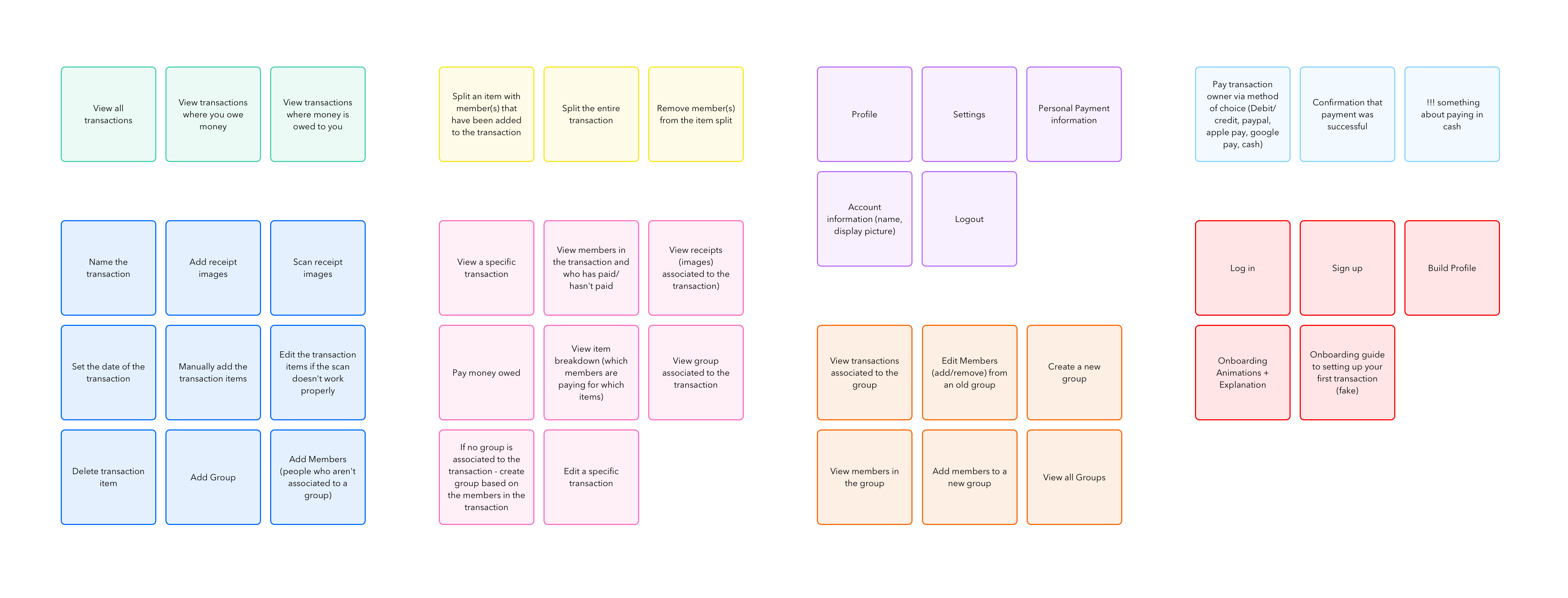
Compiled Card Sorting Results.
Looking at all the features, I used a simple card sorting study with a few participants to create mental models of our users. I took all features and listed each out as actionable items by users. I needed to be very cautious in how I worded each action to ensure I did not create a bias. This study was crucial to help me see which actions users found difficult to understand and to visualize how users grouped the information. From here, I analyzed the results and created final groupings of the information that matched the majority of the participants.
3. Flowchart
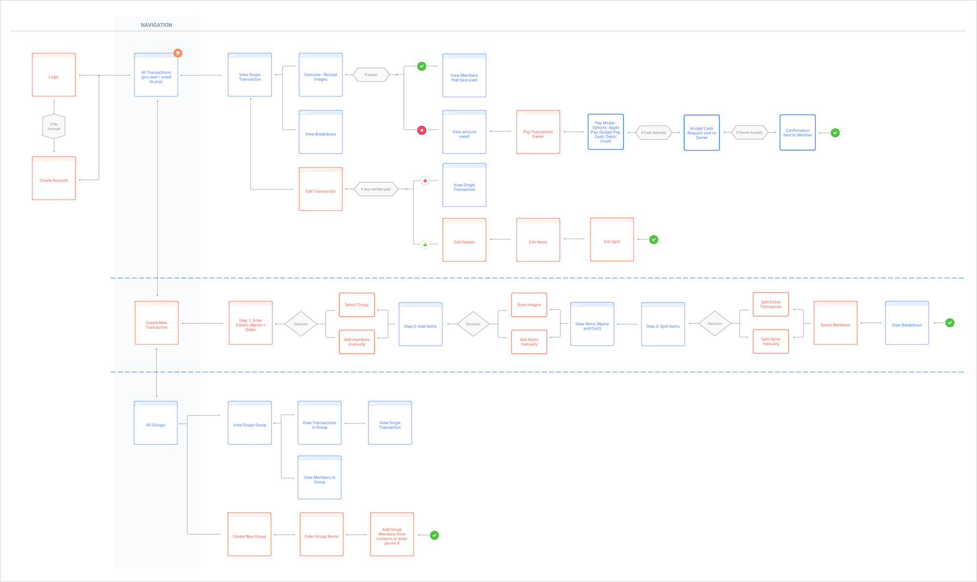
Flowchart defining the screens in the application and the navigation between them.
With the actions and information grouped and solidified, I then created a flowchart to depict how the user would maneuver through the application. The card sorting study helped identify major actions that drove the navigation. Using the flowchart, I then sat down with the developers to discuss the proposed architecture making changes where necessary. During this step, we discussed the developer’s technical constraints and how the designs needed to accommodate such limitations. Identifying these early on helped tremendously in designing work-arounds, so that our solutions were not just band-aid fixes.
4. Defining the Scope Doc
To stay organized and on the same page as the developers, I wrote up a scope document of the project listing out which features and actions will be included in the first version. Here we also discussed the areas of concern and implementation difficulty. After finalizing everything included in V1, we planned out the project sprints by features.
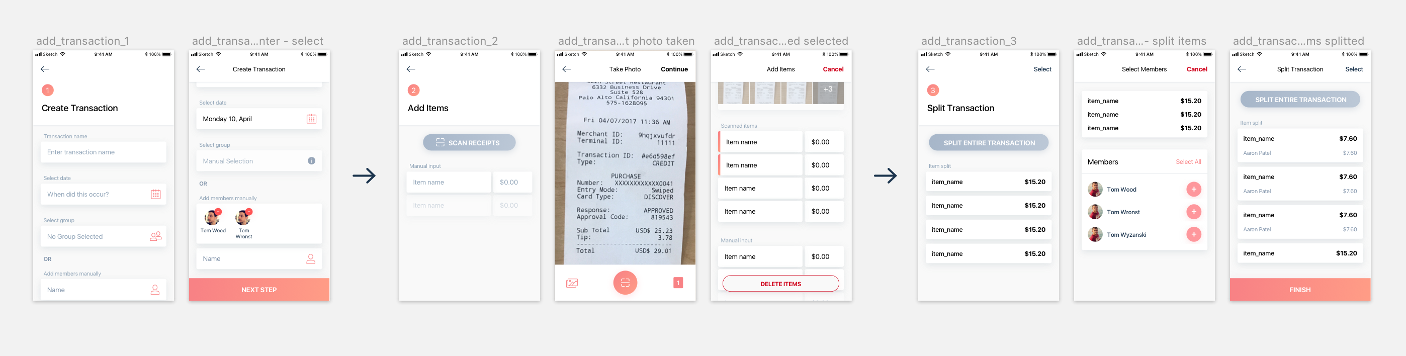
5. Designing v1
I first created lo-fi designs by mapping out what information would be presented on which screens. I then began designing for iOS, using Netguru’s LunchTime app as the baseline for the visual design. Next, I had the challenge of recreating the screens for Android. Due to my unfamiliarity with material design (I’m an Apple user! 🙋), this project really pushed me out of my comfort zone in design. I had to dig through the material design documentation and flush out exactly what components are used for what types of information. I forced myself to be extremely detailed, ensuring my spacing, font sizes, and shadows followed the material guidelines properly. The process continued for each sprint; designing feature by feature with iOS first then recreating the screens for Android with the proper material counterpart.
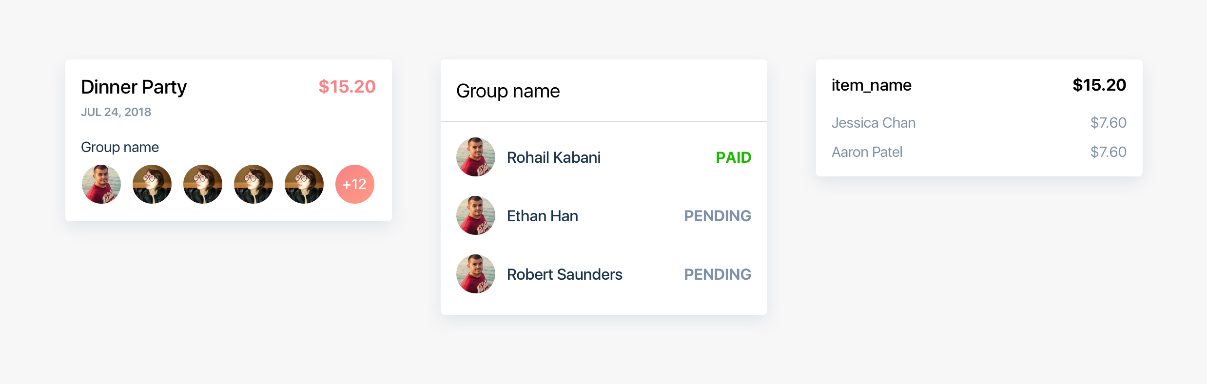
Different information displayed within a card, maintaining the overall style (iOS).
Conclusion
This passion project has really pushed me through the entire process of app design. At first, my naive self believed that designing a “few” screens would not be difficult at all, when in reality, this project was much bigger than I imagined. Now, upon reflecting on the process, I see that I uncovered usability issues, architectural flow problems, multi-platform app consistency difficulties, and many more roadblocks. I learned how a solution to a UX problem may uncover new issues, how everyone’s mental model on tackling action is different, and how many edges cases there are. To conclude, there is a lot more I need to learn and grow as a designer.
 courtney
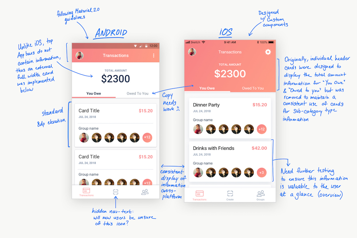