Process
1. Design Sprint
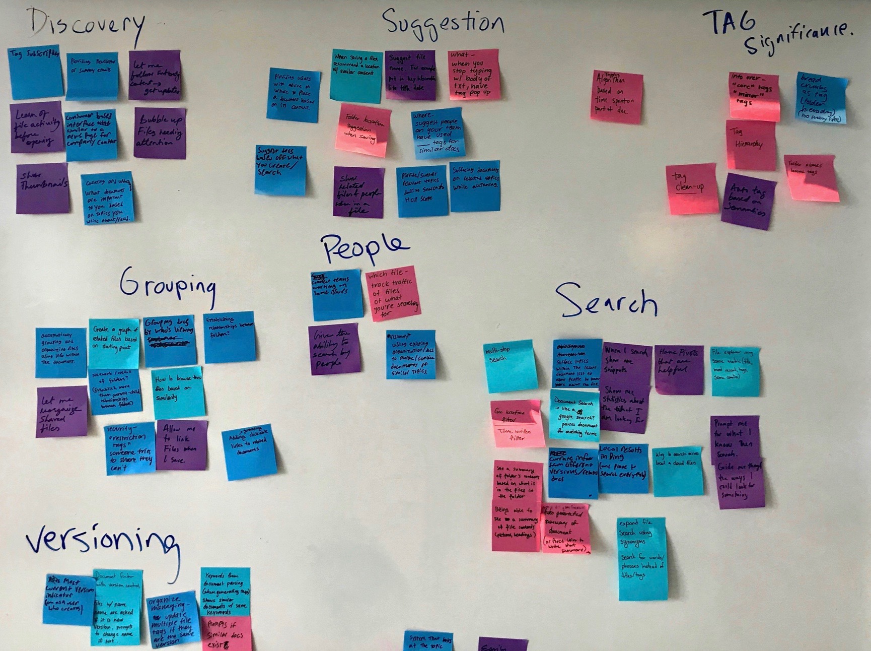
To kick off the project, we held a three day design sprint to formulate our ideas. This process consisted of affinity mapping of problems and solutions, target audience definition, 8-second sketching, red-dotting of ideas, and storyboarding. At the end of this process, we had sculpted out our minimal viable prototype which will be used to guide our initial weekly sprints.
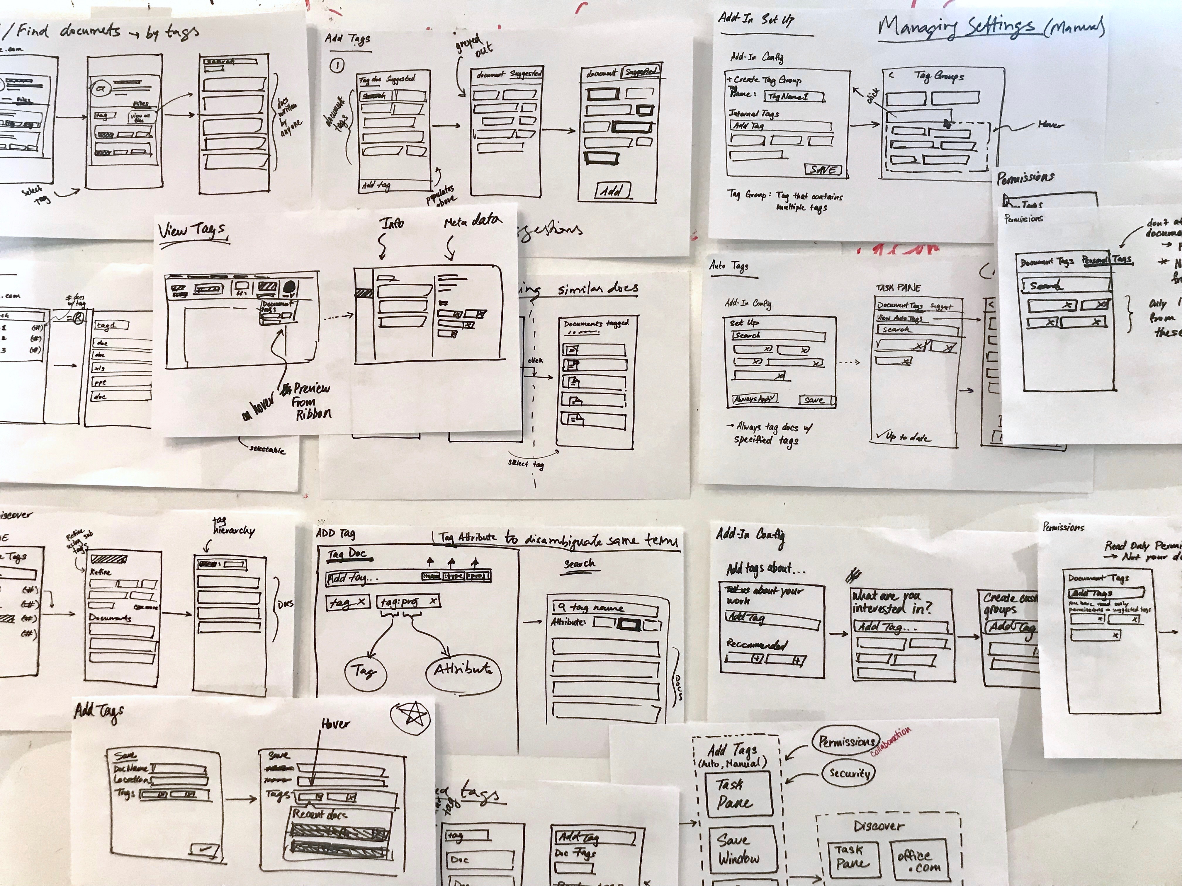
Sometimes you just need to design like crazy.
2. Customer Clinics
To find out about this problem, customer clinics were held. This is where we would work with specific companies to gain feedback on our products. In this session we focused on collaboration between office products. We held brainstorming activities to dive deeper into the problem space and to think creatively about a possible solution. Afterwards, a cognitive walk, where we showed a group of 10-15 customers the proposed design of our product to gain real tangible feedback.
Affinity map of problem categories (left), brainstorming a possible solution flow (right).
3. Designing for the Office Ecosystem
A key factor when designing a feature for Office applications was to keep in mind of the Office ecosystem. The Office365 suite of applications thrive when the interactions between applications is a seamless and a consistent experience. Consistency is created with repetition of user workflows, UX patterns, and visual styles.
Smart Tagger created consistency by leveraging the existing tagging patterns in OneNote. The similar UX pattern is used across other external products with tagging and would feel natural for Microsoft customers. For visual consistency, Smart Tagger used FabricUI, Office365’s design system. This ensured that Smart Tagger will look the same as other features within Office applications. An additional benefit with the choice to use FabricUI, was that the development process will be simplified by leveraging the pre-built components.
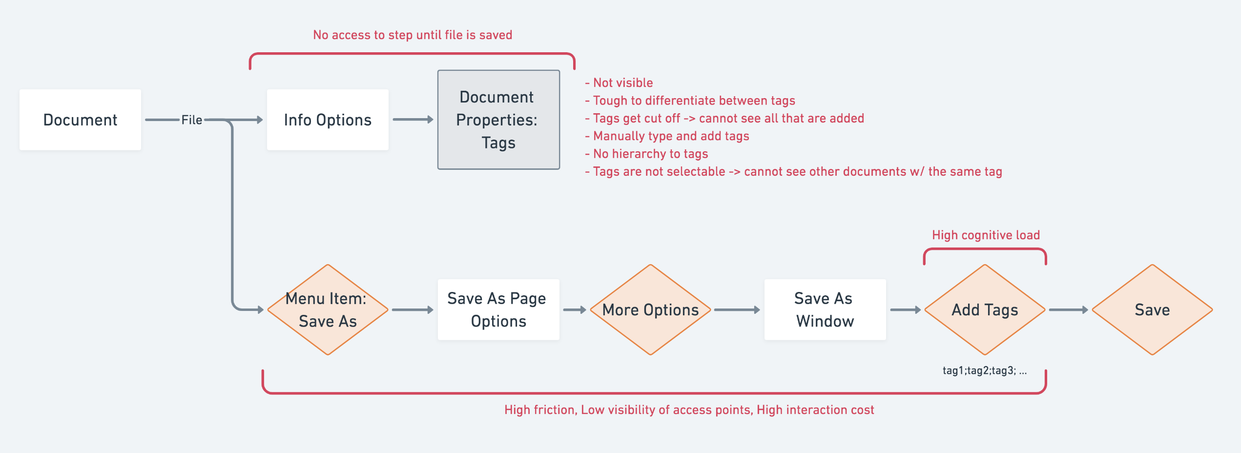
The last key factor in designing for the Office ecosystem was to design with the full cycle in mind, in other words, designing to “close the loop”. Tag entry may be the action of focus for Smart Tagger, but it is equally important to understand the impact of tags during the search process. Although designing how tags are searched is out of scope, mockups and design explorations were created to help the team visualize how Smart Tagger fits into this problem space.
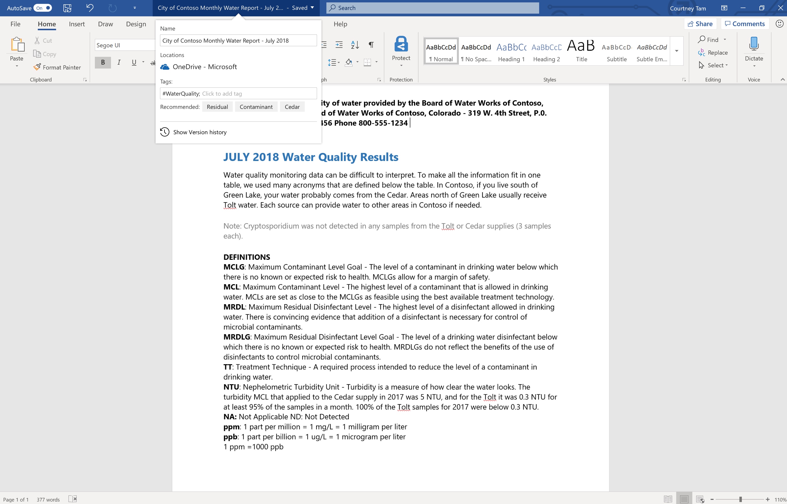
Save-As flyout tag entry (left), tag display on document list (right).
4. Accessibility
The goal for Smart Tagger was to be a well-designed feature that was accessible to users of all abilities. This included those with low vision, blindness, colour blindness and motor impairments. Smart Tagger was designed following accessibility guidelines for color contrast, keyboard navigation, and screen readers.
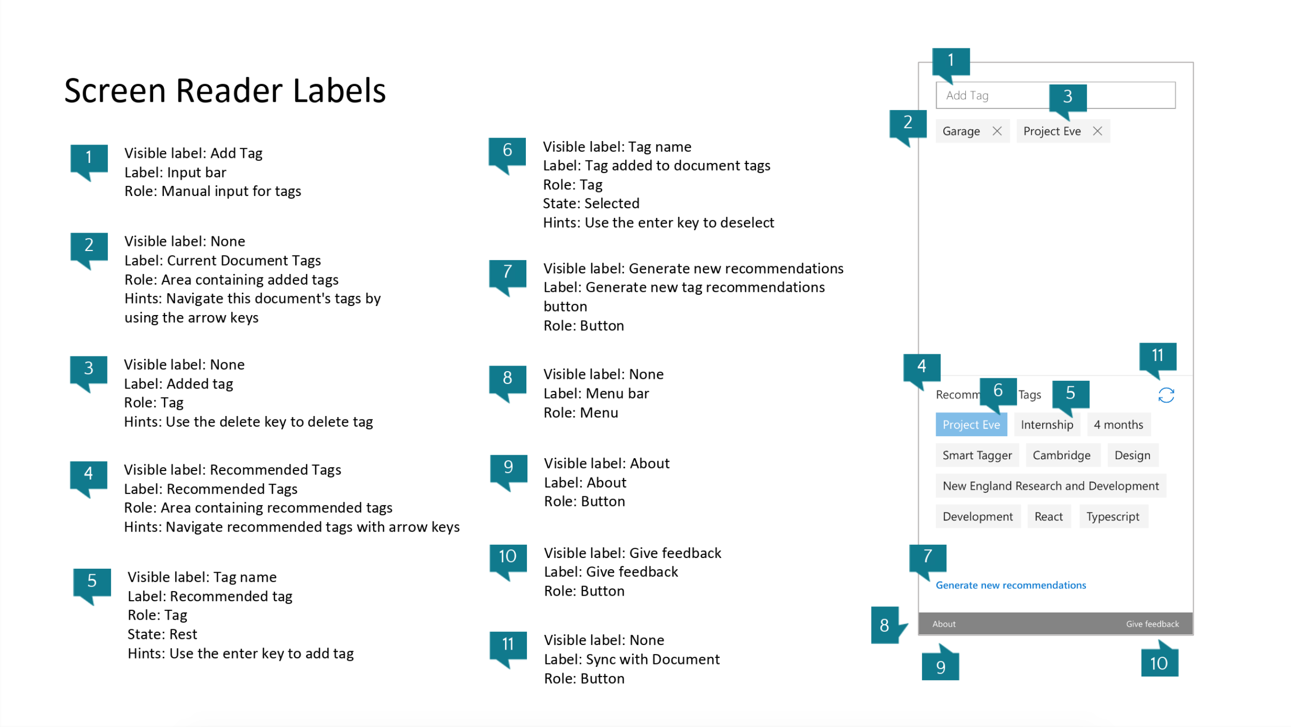
Screen reader accessibility markup of Smart Tagger
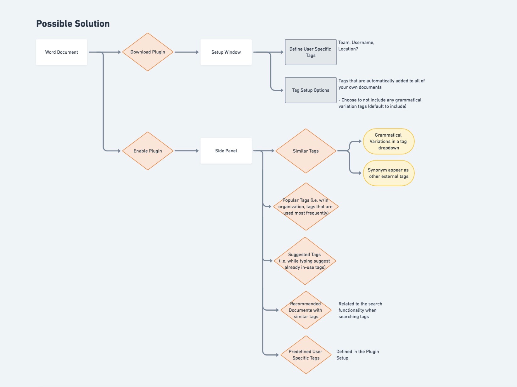
5. Future Explorations
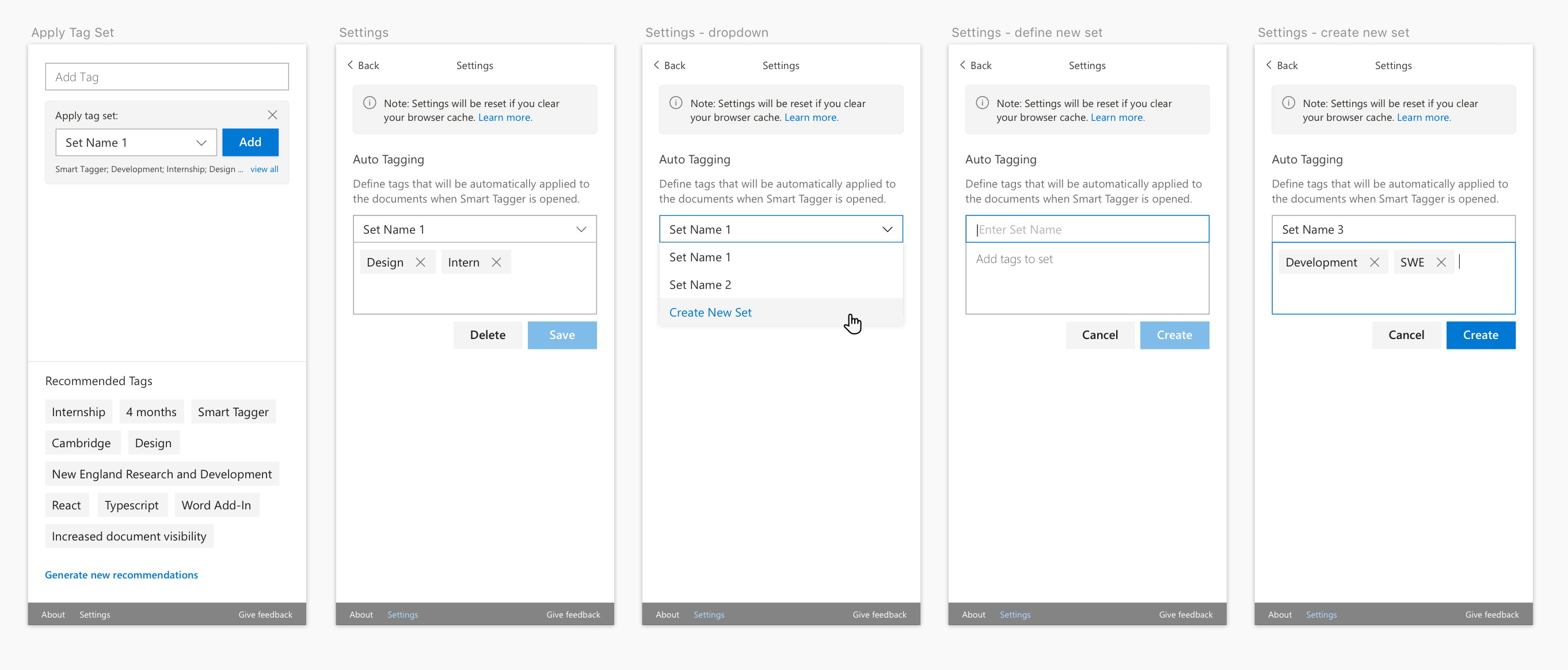
TAG SETS
The concept of tag sets were brought up by users who talked discussed the need to tag multiple documents with the same tags. They explained how tedious the current process was, where a Word document would be used to record tag lists to copy and paste into document metadata. With tag sets, Smart Tagger would allow users to save multiple tags under one tag set, and then apply all tags to a document at once. By doing so, it would eliminate the need to store tag groups externally, which removes a pain point in the user’s workflow.
Example flow of the tag sets exploration
TAG TYPES
Tag types were driven by the difficulty and errors occurring when uploading files on to SharePoint. This was brought to the team’s attention by L.L. Bean, who required their employees to define specific types of tags on each document prior to uploading the file. To circumvent this step, users would enter terms such as ‘unknown’ and ’n/a’ to each field to bypass uploading errors which cluttered the corpus of tags.
To solve this issue, the concept of tag types were introduced. Tag types allowed the user to preface the tag with a type through the same input bar within Smart Tagger. Additionally, with organizations that required specific types of tags, an informational prompt would appear on the task pane. This would notify the user of the potential SharePoint upload error early in the process.
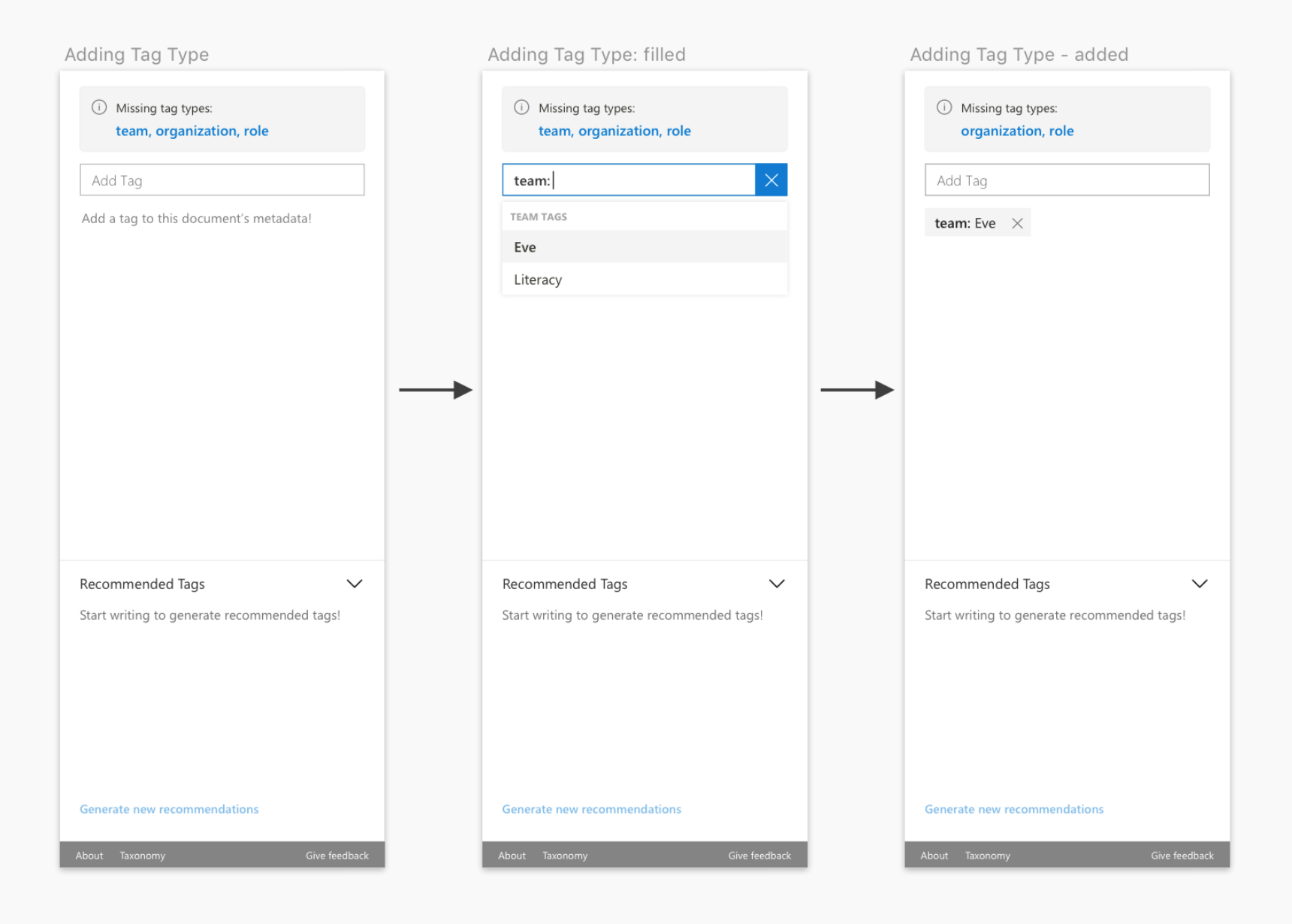
Example flow of the tag types exploration
6. Interaction Model
FIRST RUN EXPERIENCE
The first run experience screen served two purposes. Firstly, the screen served an educational purpose, where the user can learn about the benefits of tagging and what Smart Tagger can accomplish. The second reason was for the security and privacy of the customers. In order for the customers to use Smart Tagger’s intelligent tag recommendation, the user must opt-in to Microsoft Cognitive Services. Those who opt out will use s local algorithm to generate recommended tags. The opt-in option is represented within the task pane a second time to minimizes the accidental or unintended action of selecting the Call-To-Action button on the FRE screen.
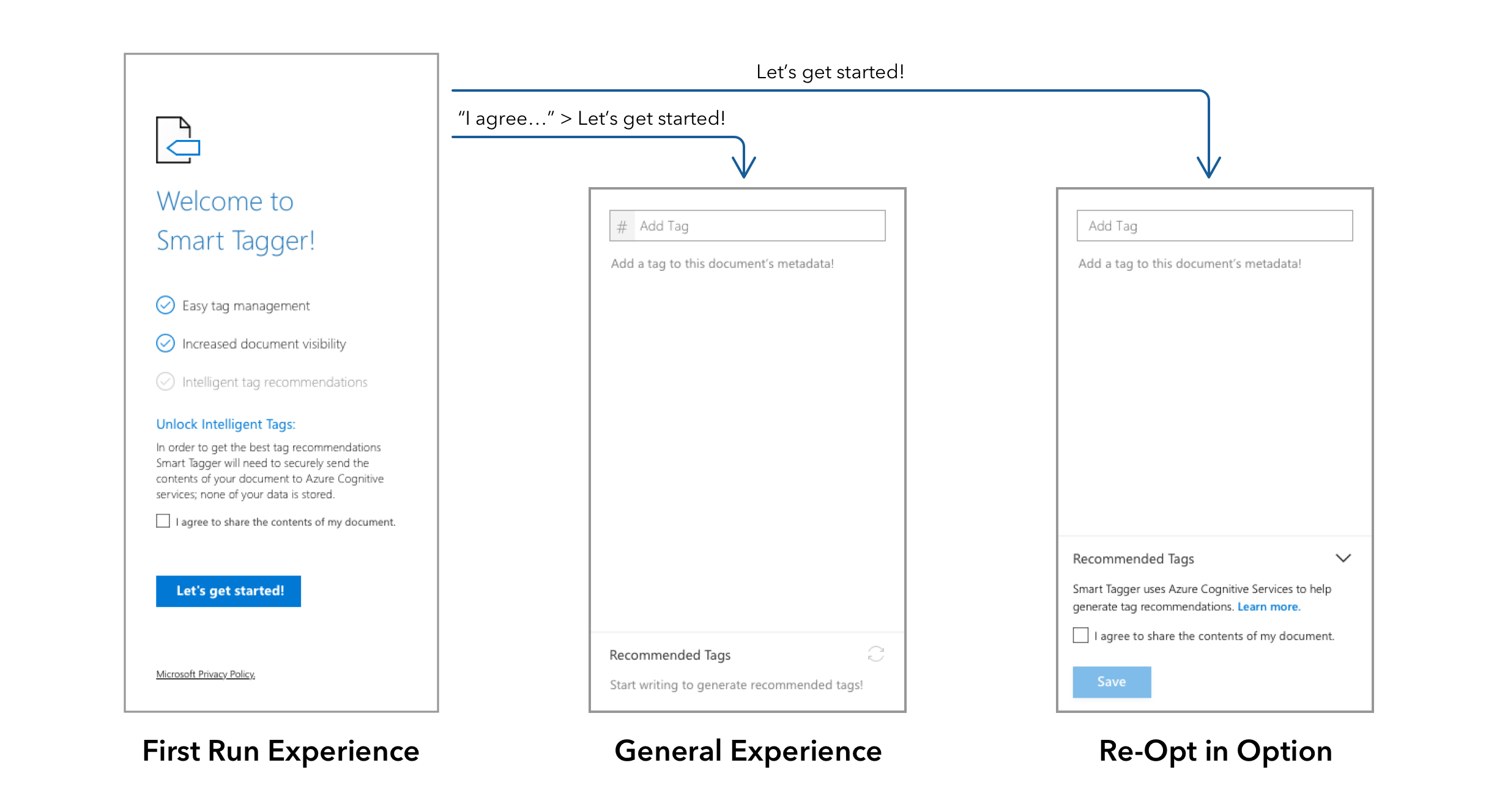
First Run Experience flow with 2 possible outcomes
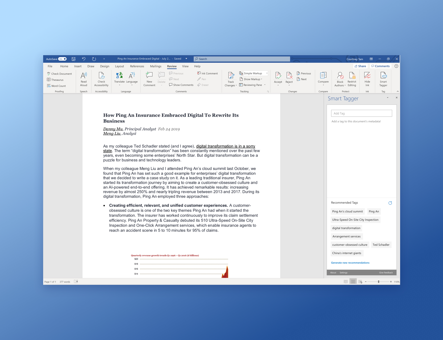
GENERAL EXPERIENCE
The general tag area is located in the top portion on the main task pane screen. It included a simple input bar and space below to display added tags. In its empty state, the display tag area included simple copy which prompted the user to add a tag. Below this section was the recommended tag area. While the user writes content in the document, the top ten recommended tags would appear. If the document has changed significantly and the top ten recommended tags had changed, the display would refresh three-seconds after the user has stopped typing. The refresh was delayed to avoid distracting users while they were working. Lastly, the recommended tag area included a simple generate tag button to allow users to show new recommended tags if none of the tags fit their needs.
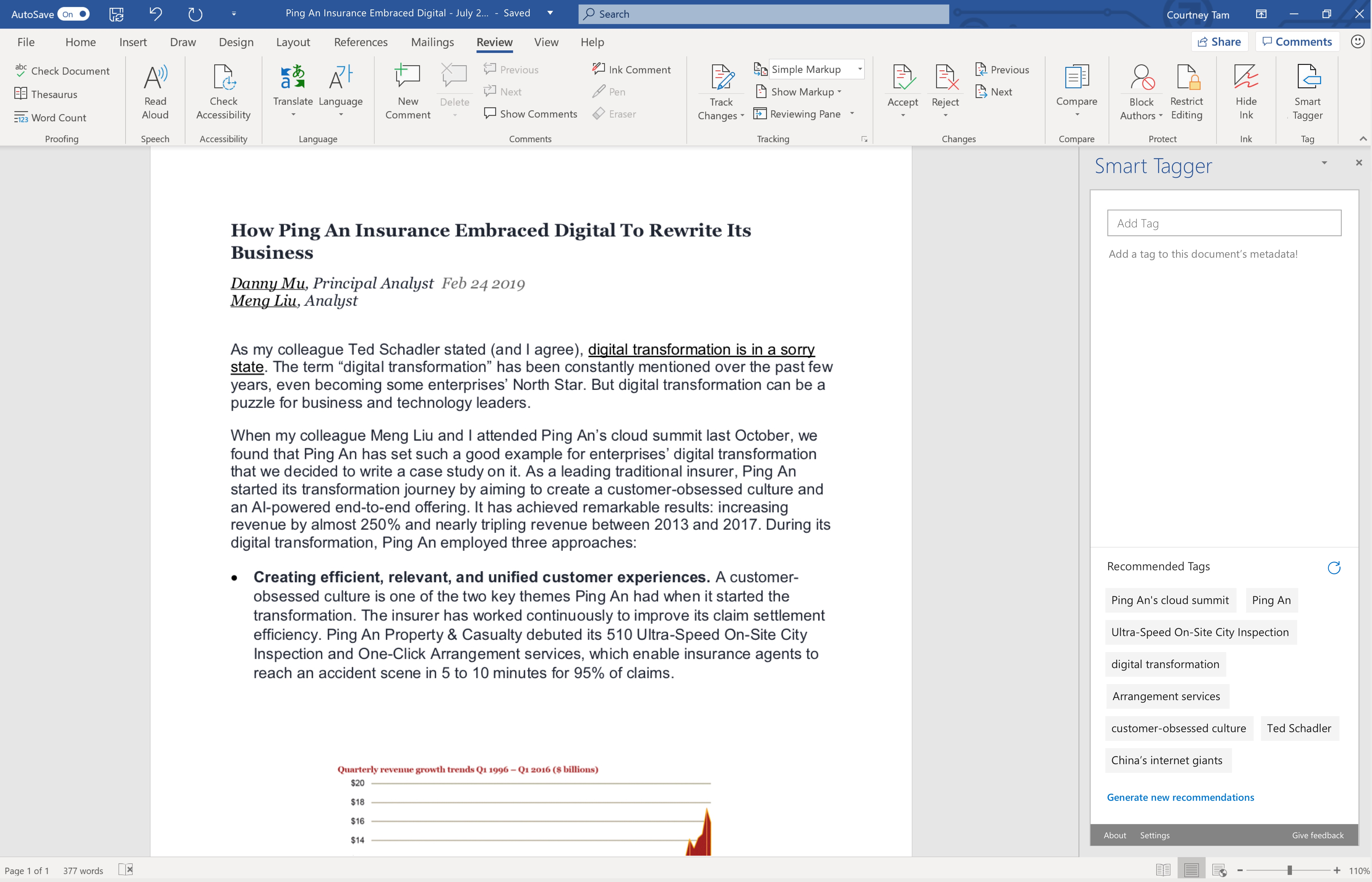
Working prototype of Smart Tagger: recommended tags are generated from document content
 courtney