Hatchful Onboarding

Company
Shopify
Year
2018
Type
UX Research
Interaction Design
Hatchful is a logo maker available on desktop and mobile with thousands of customizable templates for users to choose from. The app’s onboarding process plays a crucial role in understanding the needs and wants of the user. Originally, onboarding did not collect the right inputs from the user to display meaningful logo results. This project aims to accurately capture the user’s vision and mental model which will help decrease the drop-off rate that usually occurs after the user sees the logo results.

Comparison between Android and iOS home screen.

Role

As the sole designer on this effort, I refactored the onboarding flow and pivoted the approach in the types of information being gathered. I audited the current onboarding process using user interviews and data, and then completed a competitor analysis to understand the different issues and if they were already being solved elsewhere. Taking those insights and considerations, I conducted research through surveys and user interviews, leveraged content strategists to understand how copy plays a crucial role in the user’s understanding, and applied usability and interaction methods to create the final design flow.

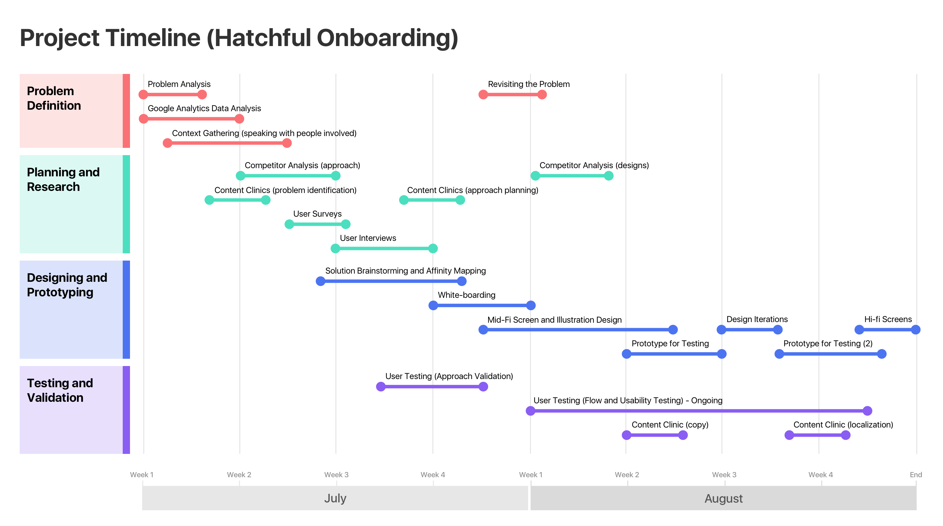
Project timeline in the 4 main stages of the process.

Problem Space

Through content clinics and the data collected, it showed that the main issue in the onboarding flow was the Brand Value screen. Here are a few of the issues uncovered:

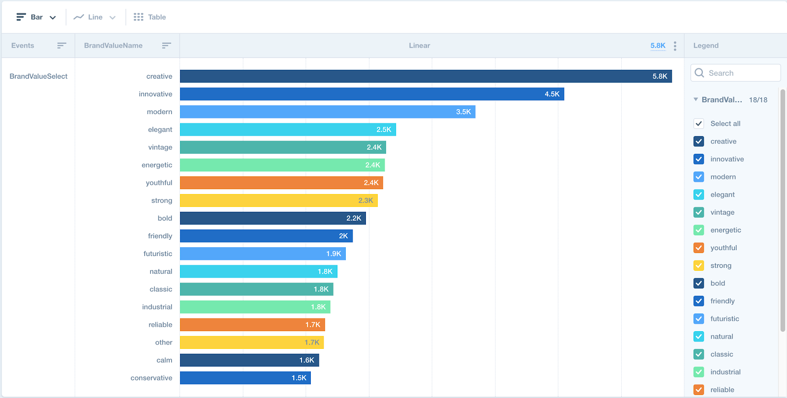
Data collected on the the brand values, indicating biases towards some terms.

UX Goals

To create a meaningful onboarding process by guiding the user to provide crucial inputs while using a low cognitive load. It is imperative that this new onboarding process can capture the user’s mental model in deciding how to pick a logo. The accuracy of the logo results will then decrease the drop-off rate and should match or simplify the logo tagging process in the CMS.

Project Constraints

Refactoring the Brand Values will directly affect how the logos are tagged in the Content Management System. The logos must be easily tagged to decrease the time spent by the team member uploading the logos. Along with this, the tags must match the mental model of both our end users and the team members to ensure that there are no discrepancies in the results shown on the application.

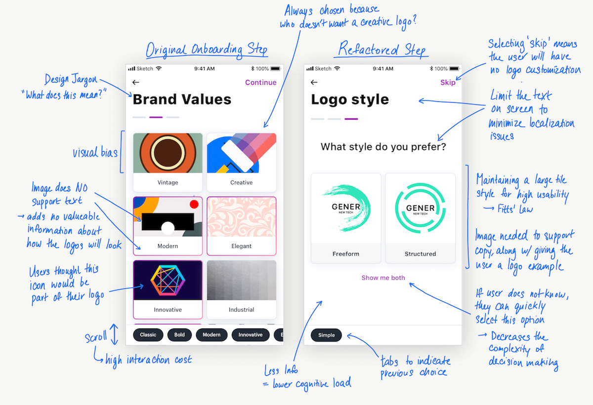
Original Hatchful onboarding flow depicting the 5 main steps.

Process

1. Competitor Analysis

To strengthen my understanding of how logo design tools use onboarding to better understand their users, I took a look at how LogoJoy, Tailor Brands, and Google’s 3hr Brand Sprint tackles this process. Key points that I looked for was the cognitive load and interaction costs, how accurately did the method capture the user’s mental model, and how useful was the information gathered (i.e. could that information be used to categorize logos in the CMS to show meaningful results to the user).

2. User Surveys

After the competitor analysis, I uncovered a few different directions of how I could refactor the onboarding process. To quickly validate or invalidate a direction, I used simple user surveys that was sent out to 50 users. The purpose was to justify the usefulness in collecting data based on the logos users like (this method is used by both LogoJoy and Tailor Brands). This survey was also to gain insight on how we might use this approach to format our tagging system in the CMS. Our results showed that no visible patterns as to why a logo was liked. Each user had a different rationale and there was no common ground to tie the data together.

Survey results showing no visible patterns why logos are liked.

3. Brainstorming + Affinity Mapping

A key issue identified was the subjective nature of the current Brand Values. The terms chosen needed to be carefully crafted so that there was no positive or negative connotation. I began pulling apart the logos in our system. Why was a certain logo considered vintage or modern? Was there an explicit attribute that gave the logo a certain feeling that was not subjective? By dissecting different logos and design styles, I found 4 spectrums that defined different parts of each logo that had no overlap and no subjectiveness. Each spectrum had a pair of polar opposites and are: Simple vs. Complex, Free flow vs. Precise, 3D vs. Flat, and Abstract vs. Literal.

The aha moment! We finally found a possible solution.

4. User Interviews + Testing

This new direction of the “Brand Values” was quite a drastic change from our previous method. In order to validate this direction, I conducted user tests to see how users would perceive the concept of categorizing the logos into these 4 spectrums. I curated a list of logos all with different styles and compositions, then asked users to label which term (i.e. simple, complex, or neither) in each spectrum matched the logo the best. The results after 4 user tests showed a 71% match. Users also understood the terminology easily and felt that the task was very easy to complete.

5. Speaking with Content Strategies

Moving forward with this direction, I spoke with 2 content strategists to help finalize the copy. Shopify ensures that the vocabulary used falls within a 7th grade reading level so the terms chosen for this screen must adhere to this guideline. A few updates were made such as “Free flow vs. Precise” to “Freeform vs. Structured”. We also changed the name of the screen to “Logo Styles” since it fit the content better and is more easily understood than “Brand Values”. Lastly, since the user is making a binary decision, it is best that they are prompted with a question. A simple question such as “What style do you prefer?” can be used for all 4 spectrums which is key in limiting the copy used.

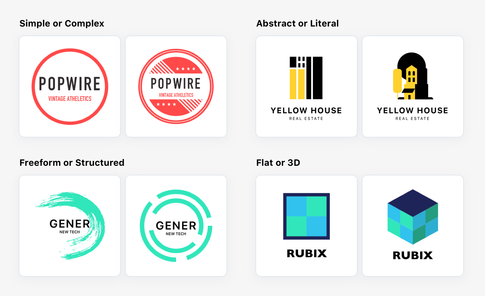
Onboarding logo images to describe the 4 spectrums of logo styles.

6. White-boarding Session

Working with two other designers on the Hatchful team, we revisited the current onboarding flow by defining the cognitive load and interaction costs of each screen. We removed “Logo Usage” because the user’s input did not add any value and was just a data collection point for the team. We then reordered the flow so that the steps with the lowest cognitive load would go first. The new flow became: Business Name —> Industry —> Logo Styles. Afterwards, we participated in some Crazy 8 ideation sketching, and finally narrowed our options down to 2 potential solutions. Lastly, we consulted with the developers to gauge the level of difficulty in the implementation.

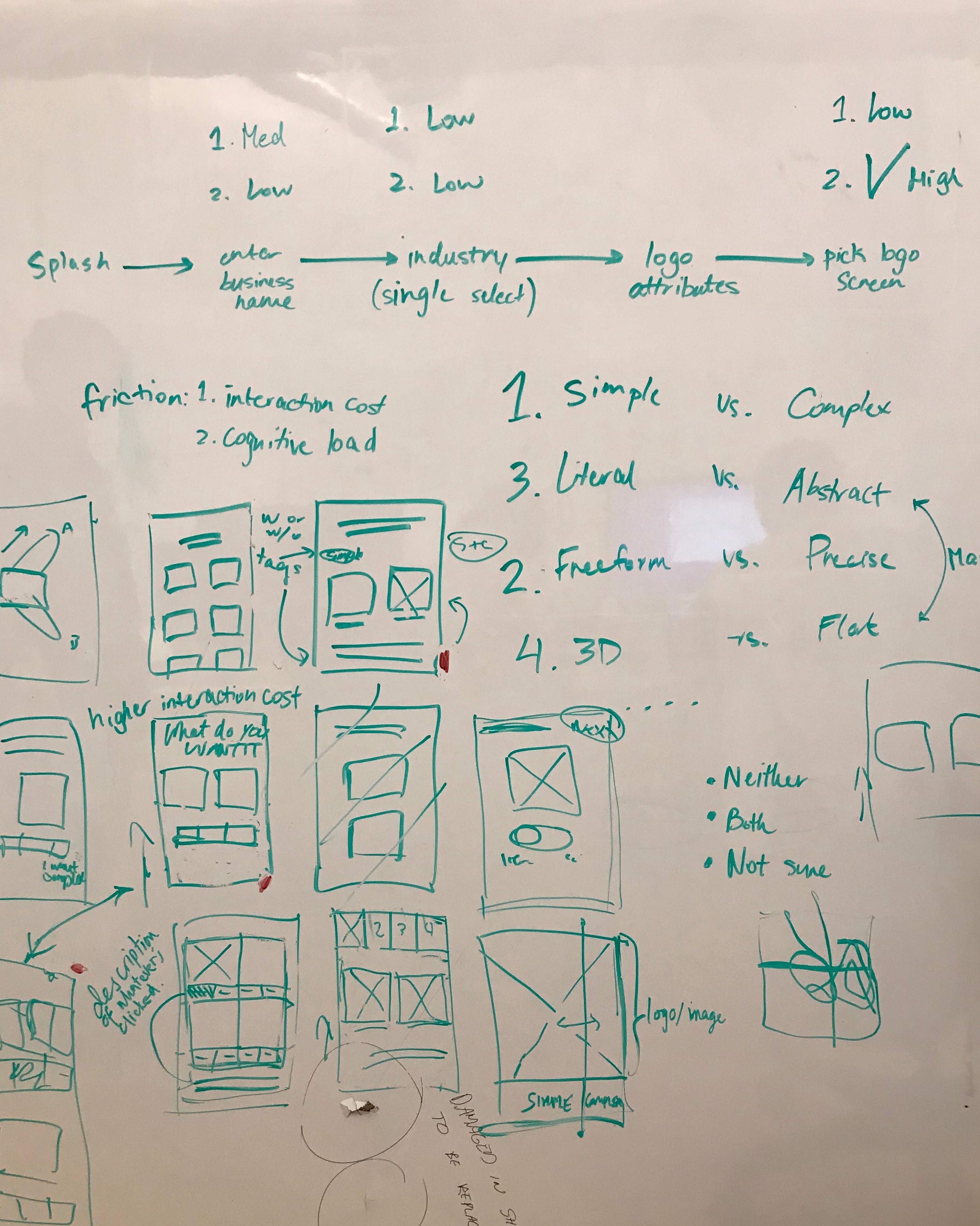
Whiteboarding session with the design team trying to find a solution.

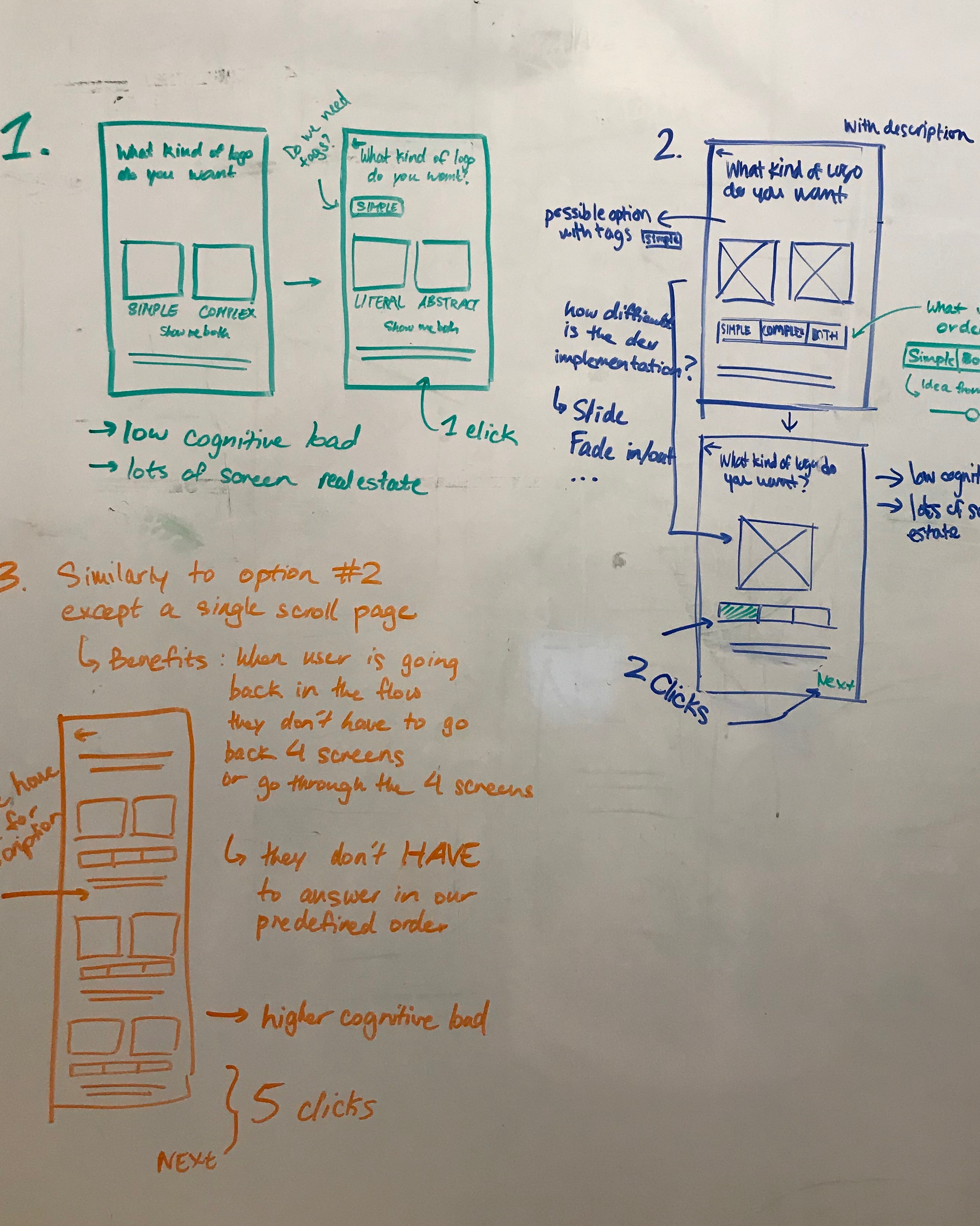
7. Design, Test, Iterate, Test, Design again

I designed a solution based off of Option #1 from the white boarding session and tested it with users. It uncovered a few problems relating to the amount of context a user has, the pace of content, the interaction costs, and usability issues. I then designed Option #2 and tested it. The issues from the first option were solved, but it uncovered new issues. The process of designing and testing, reviewing with peers, and designing some more continued until the final design was set. Android, iOS, and web were created and prepped for developer hand-off.

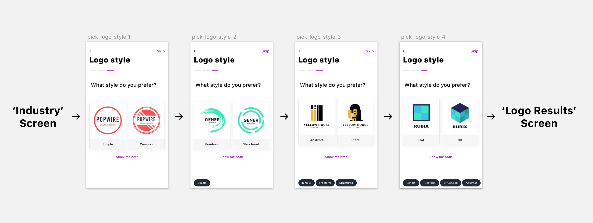
New Hatchful logo style flow depicting the 4 spectrums used to customize logo results.

Conclusion

The logic and interaction for the new Onboarding flow will be implemented in Hatchful 2.0 and all subsequent product releases. The new “Logo Styles” accurately captures the user’s mental model by defining their needs in a non subjective manner. The logic is easily integrated into the CMS by changing the tagging system to hold all 8 terms. This new format meets the criteria of our business operations team who uploads the logos, and tags them accordingly. Next steps will be to evaluate the data collected through this onboarding step, and to use this data to drive the types of logos being added to the system.

Ending Thoughts

Through this process we constantly pushed for low friction which meant low cognitive load and low interaction cost, which leads to less time spent on a step. However, reducing the time spent on a step doesn’t always relate to better user experience and content quality. To ensure the user is receiving the best logo results, we require them to spend a little extra care and time in their onboarding choices.
Next Project:
Big Blue Button