Hackathon Design

Company
Queen's University
Year
2018
Type
Brand Design
Visual Design
Interaction Design
QHacks is a yearly Hackathon held at Queen’s University starting from 2016. As this event continues to grow and evolve, multiple digital aspects of QHacks must improve as well. In collaboration with the QHacks team, we are currently creating a new QHacks brand that includes a website, hacker and partner dashboard, brand package, UI components, and additional design assets. The purpose of this rebranding is to solidify QHacks’ image and to properly capture the event’s magical and prosperous feel, in addition to maintaining the consistency across all products. This project is ongoing starting July 1st with a projected end date of February 1st, 2019.

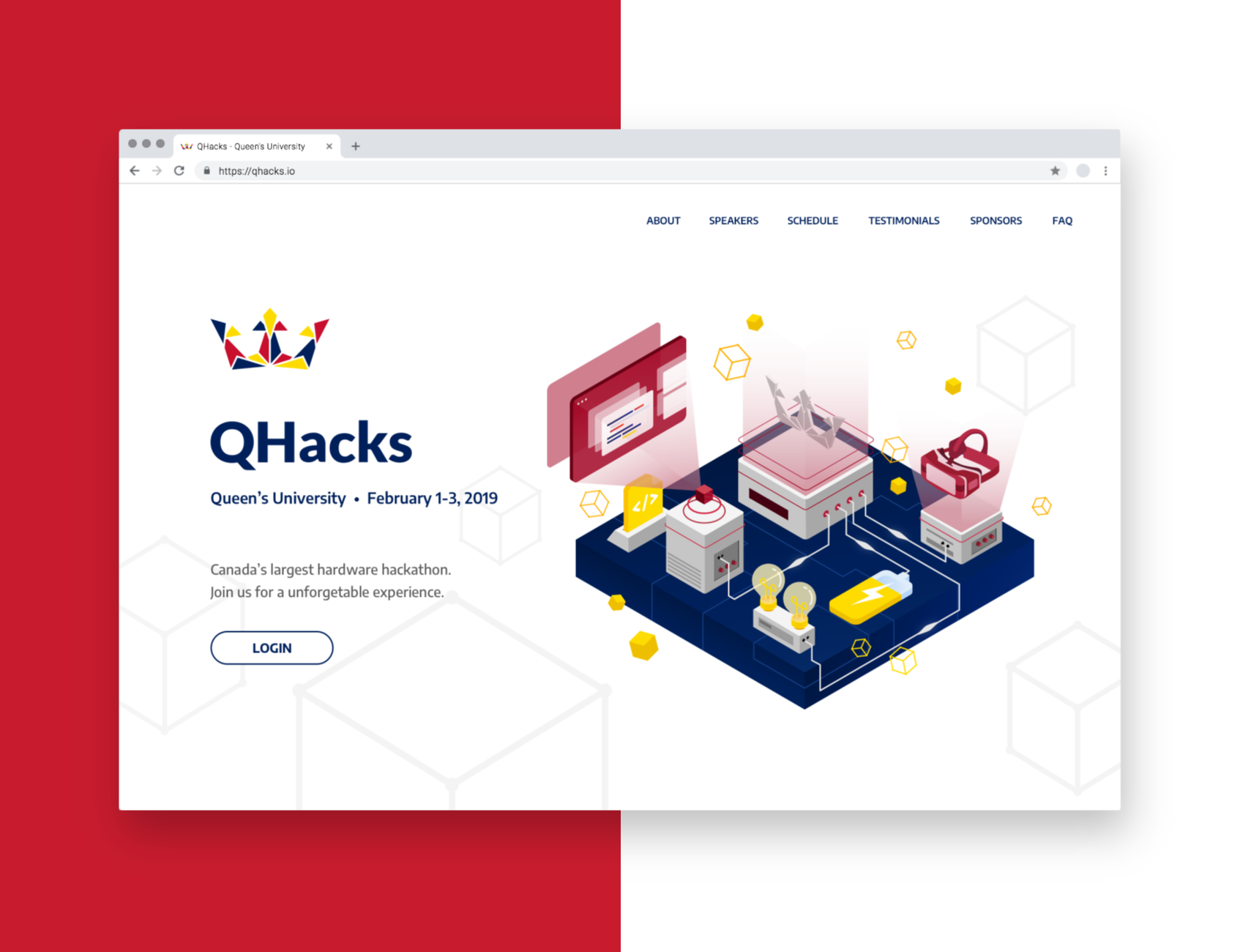
Qhacks landing page with custom illustrations.

Role

As the sole designer on this effort, I will be designing the website, brand package, UI components, hacker and partner dashboard, and additional design assets. Through this process, I will be auditing the current products, conducting a competitor analysis for every product, conducting usability and interaction research, and testing my designs using user interviews and data collection. A few things I will be focusing on is the flexibility and durability of the products, ensuring that they will easily be reused and built upon for the following years. Lastly, I will be working remotely from the team, however, I will be in contact with the project leads and developers on a consistent basis.

Overall UX Goals

To create a brand that fully encompasses the vision sought out by the project leads that is consistent through all products and to create flexible and scalable products that can easily be modified for the following years. For the website and brand package, I will be focusing on the engagement of the designs and the types of emotional responses it evokes in the users. For the dashboard and UI components, my focus will be on the interaction and usability of the products, ensuring the designs utilize proper interaction patterns and will maintain a low cognitive load for the user.

Website

After a product audit and a competitor analysis, the results showed that the current website did not influence, attract, or evoke a feeling that the event is “magical,” “inviting,” and “fun”. A website, being the face of the event needed to appeal to hackers across North America and prospective sponsors. With a strong brand, users will identify with the event and the value that comes from it.
Check out the site: qhacks.io

1. Utilizing Illustrations

Illustration is a powerful way to communicate the mood, message and visual identity of the event. Not only does it enrich the brand’s visual language with more than just a logo, colour scheme, and typeface, it also is a strong way to keep the consistency over multiple products. Here, I created custom illustrations to capture the magical feeling of the event, while also communicating different aspects of a hackathon such as collaboration, networking, learning and hacking.

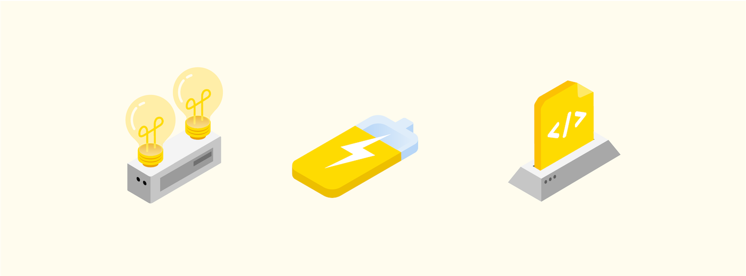
Small isometric illustrations to be used through brand assets.

2. Site Design

After reviewing the design for the previous year’s site, there were a few interaction issues that would need to be addressed. The site is a single scroll site with multiple sections without navigational links that are fixed to the top of the site, making it very difficult to jump to sections. Also, the schedule header should not be an interaction button to show and hide the schedule. Lastly, the overall UI design would need to be created to match the new brand and style.

• PROJECT IN PROGRESS •

This project is currently in progress; the projected end date is February 1st, 2019. I will be updating this case study as components of the project are completed. Contact me if you would like more information! :)
Next Project:
Divide App Design